Landing page optimization is one of the most effective ways to generate leads. However, many companies do not focus their attention on designing landing pages that continually attract new leads.
Without new leads, you won’t acquire new customers. And without new customers, you won’t generate sales.
When a prospect lands on your page, what elements do you have in place to convert them into new leads?
If you want a sustainable lead-generating landing page made to convert visitors, while also learning how to keep those customers, keep reading.
This article will show you landing page optimization tactics for generating leads. You’ll learn what you need to include in your design, ad copy, and images to better convince users to convert.
Design Landing Pages that Convert
Don’t just design any landing page; design a lead generation landing page. This type of page is specifically designed to capture personal information about a prospect such as a name, email address, phone number, and more. The goal is to then use that information to nurture that prospect throughout your sales funnel.
Here are the top tips for designing a lead generation landing page.
Use catchy titles/ Less content is more
The best approach when it comes to content is that less is more. Keep your landing page copy short and sweet, in an easy-to-scan format. Don’t overwhelm users right away with too much text or information or they could bounce quickly.
Align the content and titles on the page with client goals. If you know your clients are looking for a company that designs Blockchain marketing solutions, clearly state that in the title and copy.
Particularly if you are running a PPC campaign, make sure the keywords you are using are reflected in the headline of both your ad and the landing page. Feature the same language so visitors are reassured they are on the right page.
Once they are on the page, keep them there! Get rid of navigation at the top of the page, or links that take the user elsewhere. Remove all distractions to keep your prospects focused on providing their information.
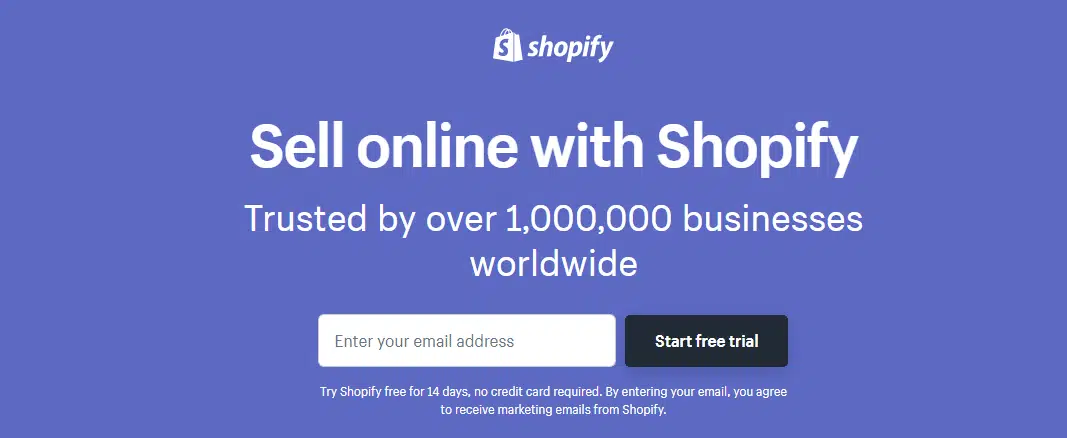
Shopify does a good job of keeping things simple. Their headline is a few works and includes an additional line of social proof. Their form only has one field you need to fill to get started. All of the messaging is to the point, with no distractions from their goal of getting a user to sign up for a free trial.
Security seals/ Privacy policy

Users want to know that the information they are inputting on your site remains safe. Using security seals or a privacy policy located at the bottom of the page helps them view your company as a trusted source.
Security seals ensure that the information inputted in the form will be encrypted and secure from hackers. If you require credit card information as part of the lead capturing process, security seals will keep that data safe as well.
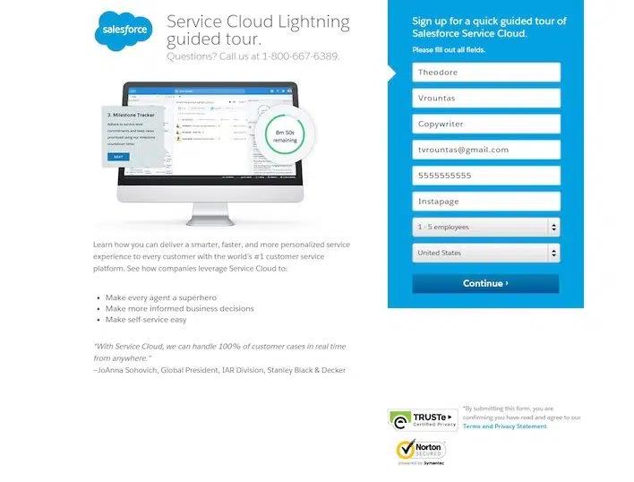
Salesforce makes use of minimal copy, a CTA that stands out, and security badges to ensure user trust.
Focus on CTA
The call to action or CTA alone isn’t what makes people click.
Visitors will click when the right elements all add up:
- What your visitors have learned about you so far
- How do your visitors feel as they browse your site
- What your visitors stand to gain once they click
An example of these elements being put to use is a scenario in which a visitor has seen your ads in the past and has learned a little about you. Once on your site, they appreciate the straightforward design and the value your product is promising. And once they spot the CTA, they notice the basic account is free, enticing them to sign up.
Your CTA should be the culmination of your business proposal set up by your page and even your ads. As such, it should be highlighted in relation to the rest of your landing page.
Design your CTA in a contrasting color
Not having distractions applies here too, as you will want to avoid images that look inorganic. Stick to graphics that are authentic to your brand and visitors will respond well.
Keep your CTA short
Around 5 words are best, and make it descriptive and simple. Have your CTA around the keywords you are using. If visitors land on your page looking to book a consultation, your CTA should reflect that.
Tell customers what you want them to do
Use action verbs, especially to create urgency in your offer. A simple formula for CTAs is command verb + offer + urgency. That could look like “Save 25% now!”
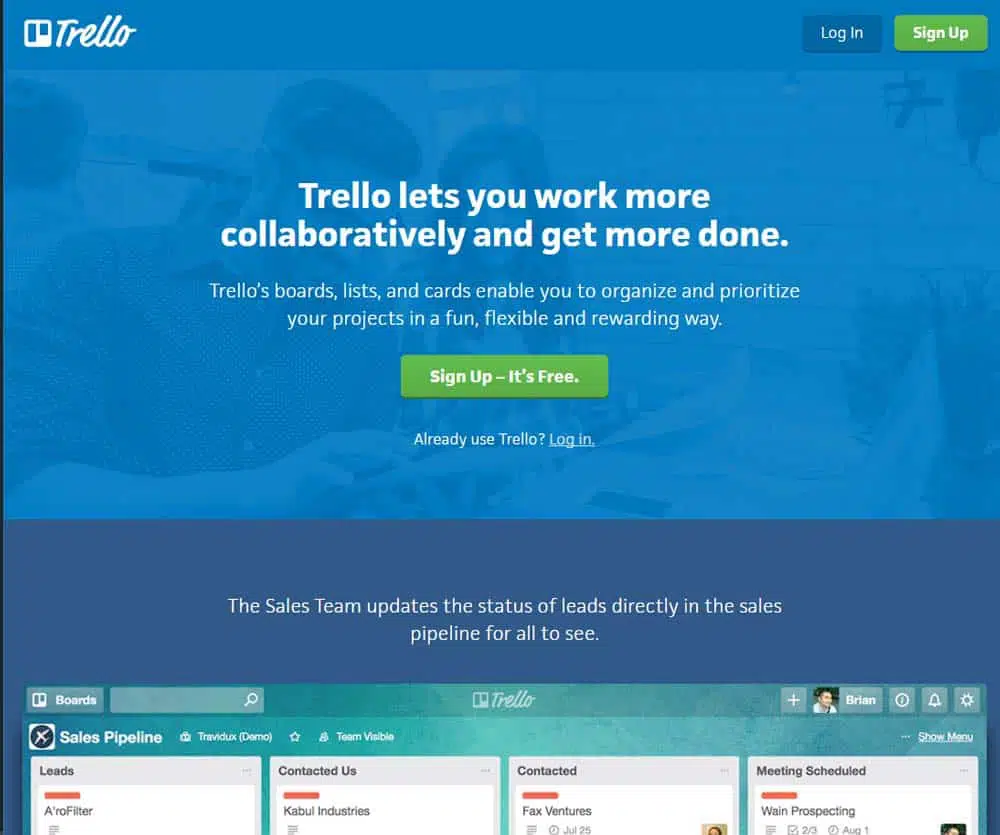
Trello’s landing page does a good job of setting up their business proposal and then following through with the call to action. The CTA itself is short and commanding, while also easing any doubt in the visitor’s mind by mentioning that it’s free.
Optimized forms
Statistics say the fewer the number of text boxes, the more likely visitors are to convert. Asking for too much information right when they land on your page causes visitors to jump ship to a competitor.
Visitors do not want to spend a long time filling out your form. Instead, to maximize lead generation, you can replace some fields with check-boxes or a drop-down menu. Having multiple selections already filled out can allow for better-quality leads while increasing your lead count.
Spend some time deciding what information is absolutely necessary to take a lead onto the next phase of your purchase funnel.
In terms of visuals for your form, place your form above the fold for maximum engagement. Placing your most important element for capturing leads in this prime location will increase exposure and boost lead captures.
Make the form stand out from the rest of the page with attractive colors and a clear value proposition. Let visitors know what’s in it for them when they fill out your form. If you put too many elements around your form, it can hurt your conversion rates.
Whitespace
Give your form plenty of whitespaces to naturally draw a visitor’s eyes to your CTA. White space also allows for more readability and can increase click-through rates. Whitespace reduces hesitation from visitors as they won’t have any friction from other elements on the page.
Multichannel Leads Generation
Different channels can work together and with each other to generate leads. Two of the most effective channels are content marketing and email marketing. You can utilize these channels to push traffic to your website and convert visitors. Your goal is to produce content on these channels that connects with the audience and generates leads.
Content marketing
There is a huge demand from users for valuable content. This demand can work in your favour for landing page optimization. If you meet a user’s need, they will trust you with any other promotions you give them.
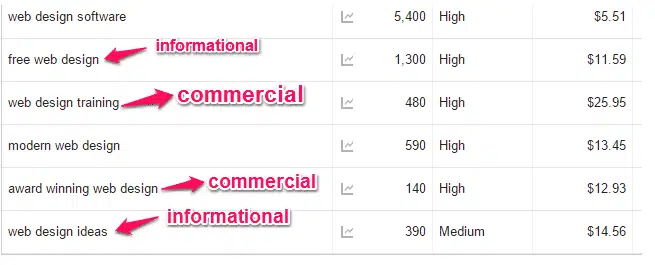
Start by determining commercial keywords for your industry. Commercial keywords tell you what your prospects intend to buy.
By answering the questions your prospects are asking, you build up your company as a trusted brand. Over time, prospects will be more willing to buy your products or services.
E-books
An e-book allows you to collect your visitors’ email addresses and place them in your purchase funnel. An e-book lets you write in-depth on a subject in our industry. The deeper you go, the more value readers can derive.
Case studies
Case studies need not be boring and uninspiring. Start your case study with a problem and tease how your company worked out a solution. Your case study needs to tell a story, preferably from a customer’s point of view, so prospects can easily put themselves in the narrator’s shoes. Walk the reader through the steps to success, and they will be willing to also get help from your company.
Email marketing
Email marketing is a powerful customer acquisition tool. You have permission to send your marketing message to a list of people who have shown some interest in your brand.
Set up email marketing automation
Email marketing automation saves time and also simplifies decisions. Instead of manually sending an email when a subscriber takes an action, you can use email automation to send the right message to the right person at exactly the right time.
Provide valuable content
If you want prospects to subscribe to your email list, you need to provide value. If your company does not have anything valuable, then users will not want to join in the first place.

Invision sends out an email with their top articles related to design that week. Each article includes actionable steps to improve design elements.
Increase conversions with the right message
Automated emails sent after a visitor abandons their shopping cart is an easy way to increase conversions. The email reminds visitors what they left in their cart, and gives your business another shot to make a sale. Remember to make it easy for subscribers to check out right from the email, reducing friction.
Testing Your Landing Page Optimizations
A/B Testing, Multivariate
A split test also called an A/B test, is a test by marketers that compares two different versions of a web page to see which one converts visitors the best.
Often a split test will change one element at a time to pinpoint which combination converts more visitors. You could even start with multivariate testing to see if there is a group of elements you should be focusing on, then work from there with a split test.
The good news is there is no shortage of elements to test. In fact, you can test each of the landing page optimization tips we’ve mentioned in this article.
Test your offer
Does your audience prefer a checklist or an e-book? Switch up what you offer on your landing page and see which one results in more conversions.
Test the headline
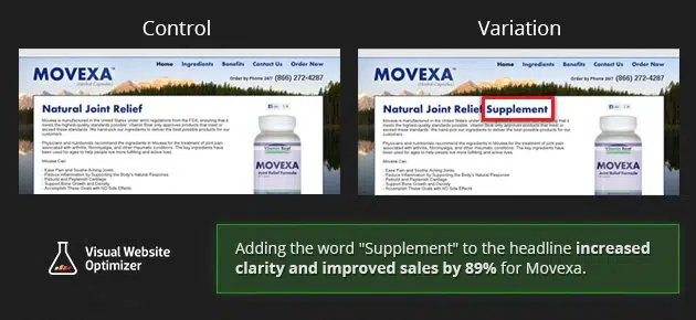
Vitamin and supplement company Movexa changed their headline by just one word and increased their conversions by almost 90%.
Test the images
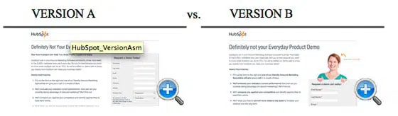
Even imagery can play a part in conversions. HubSpot removed the image seen here and increased their email signups by 24%.
Test the length of your form
Try leaving out some fields in your form and see if there’s a change in conversion rate. Again, making your forms shorter can lead to an increase in conversions.
Test your CTA copy
This is the culmination of your business proposal, so you want it to land. For example, switching from “Order information” to “Get information” uses an action word and less formal copy, enticing visitors on an emotional level.
Test where the CTA button is placed
If you have a set place where you put your CTA, switch it up a little and see if you can get more conversions from this small change.
Test the urgency of the offer
Play around with the language in your CTA to spur the reader into action. For example “Reserve your spot” implies limited accessibility and displaying the expiration date of the offer lets visitors know that they must act fast.
Test using a trust-building phrase
Try using phrases on your landing page that establish trust between your visitors and your brand. Examples include “100% Privacy Guaranteed” and “We will never send you spam or sell your information.”
Exclusive Offer
Offer up exclusivity to visitors with your landing page. You need to provide value in a way that is different from competitors and delivers on customer needs. Take a look at these examples of great exclusive offers.
HubSpot
HubSpot’s How-To headline tells readers that they will get step-by-step instructions on how to accomplish their goal. Visitors stand to gain knowledge by signing up. HubSpot also emphasizes that the offer is free.
Udemy
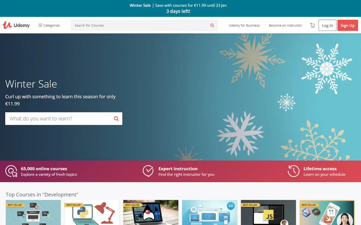
Udemy uses a banner to highlight that they have a limited-time promotion running. Their copy says that a previous offer has been extended and expires in 20 hours.
Databox
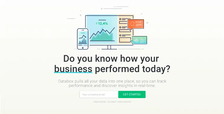
Databox uses dynamic language that engages the visitor and keeps their attention. The changing messaging makes the offer interesting while demonstrating their knowledge of customer needs. Databox also removes friction with an opt-in to get started right away, even including extra text stating that it is “Free Forever.”
Book of the Month
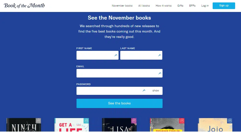
Book of the Month teases the current month’s selection of books to encourage visitors to sign up. In order to see the books being offered, you need to create an account first. This powerful incentive is perfect for their customer base.
Warby Parker
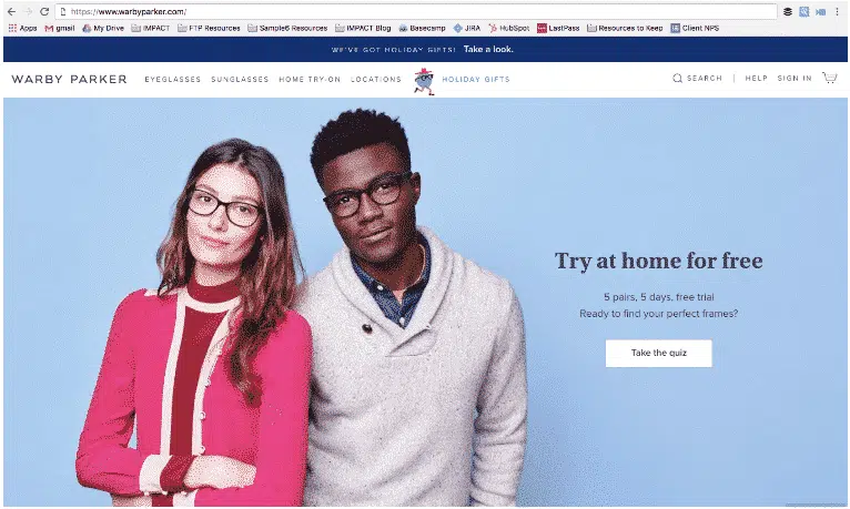
Warby Parker uses an interactive quiz for visitors to receive personalized recommendations for glasses. The quiz encourages visitors to register for the free trial where they can try on glasses at home. The campaign is fun and low-friction, allowing for more visitors to feel comfortable opting in to marketing emails.
How to Handle Common Landing Page Optimization Problems
The hardest part of landing page optimization for lead generation is figuring out what kind of content converts. Even the content in a form can determine if visitors will fill it out to complete a conversion.
It can also be hard to know if visitors will respond to friendly language or more professional language. Sometimes people will respond to one more than the other.
Improving each of these elements, tracking for conversions, and continuously testing each one will get you more conversions over time. At Markovate, we strive to design landing pages that do all of the above seamlessly, increasing your conversion rate in a short amount of time. Trust us with your landing page optimization and we’ll deliver on generating valuable leads.
Biographical Info mansi here